Gooey Cafe - Branding
Spec work, schmec work. What’s wrong with a little daydream? If it were up to me, this whole portfolio would revolve around food. I’m a self-proclaimed foodie, so restaurant branding is right up my alley.
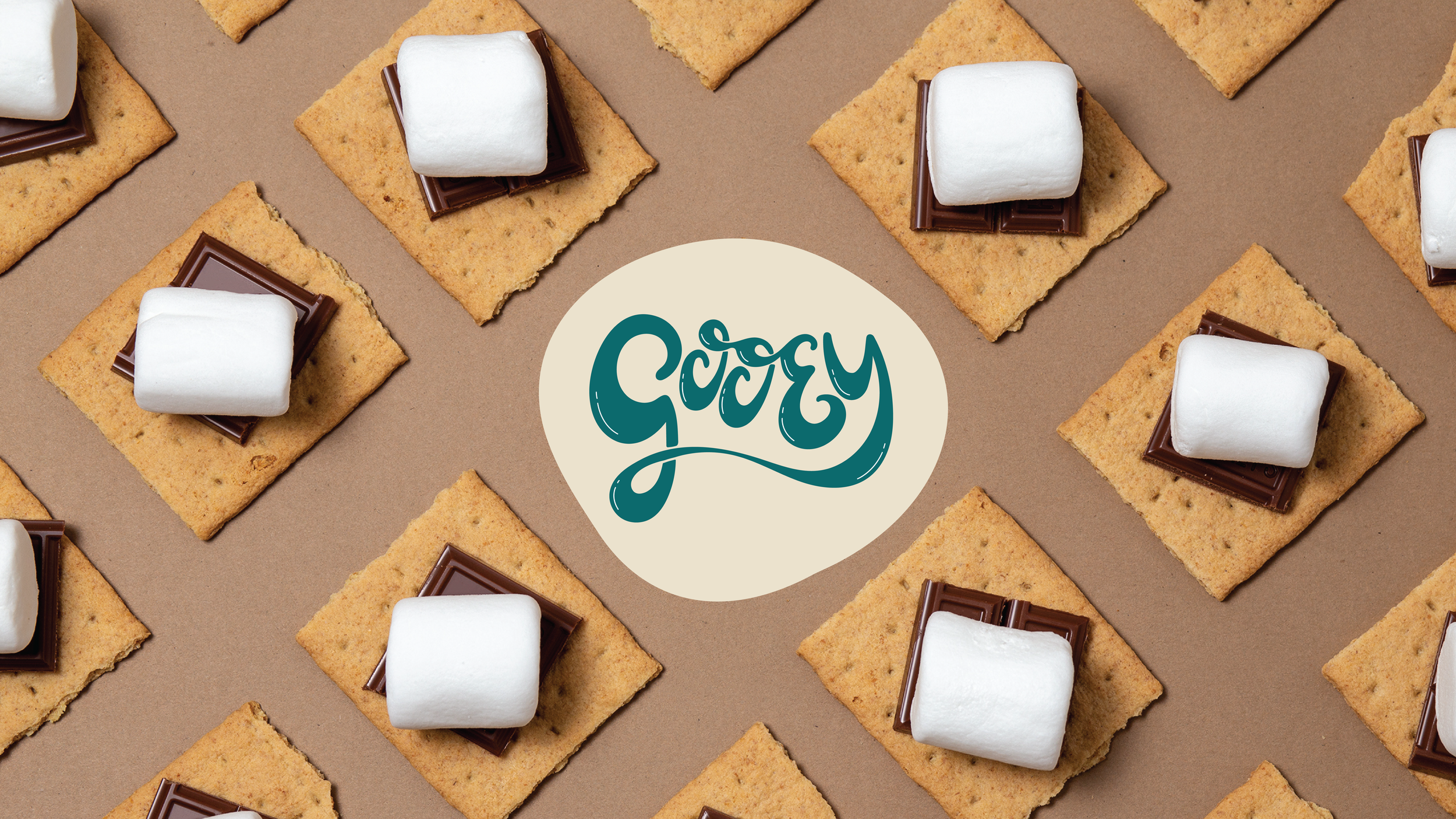
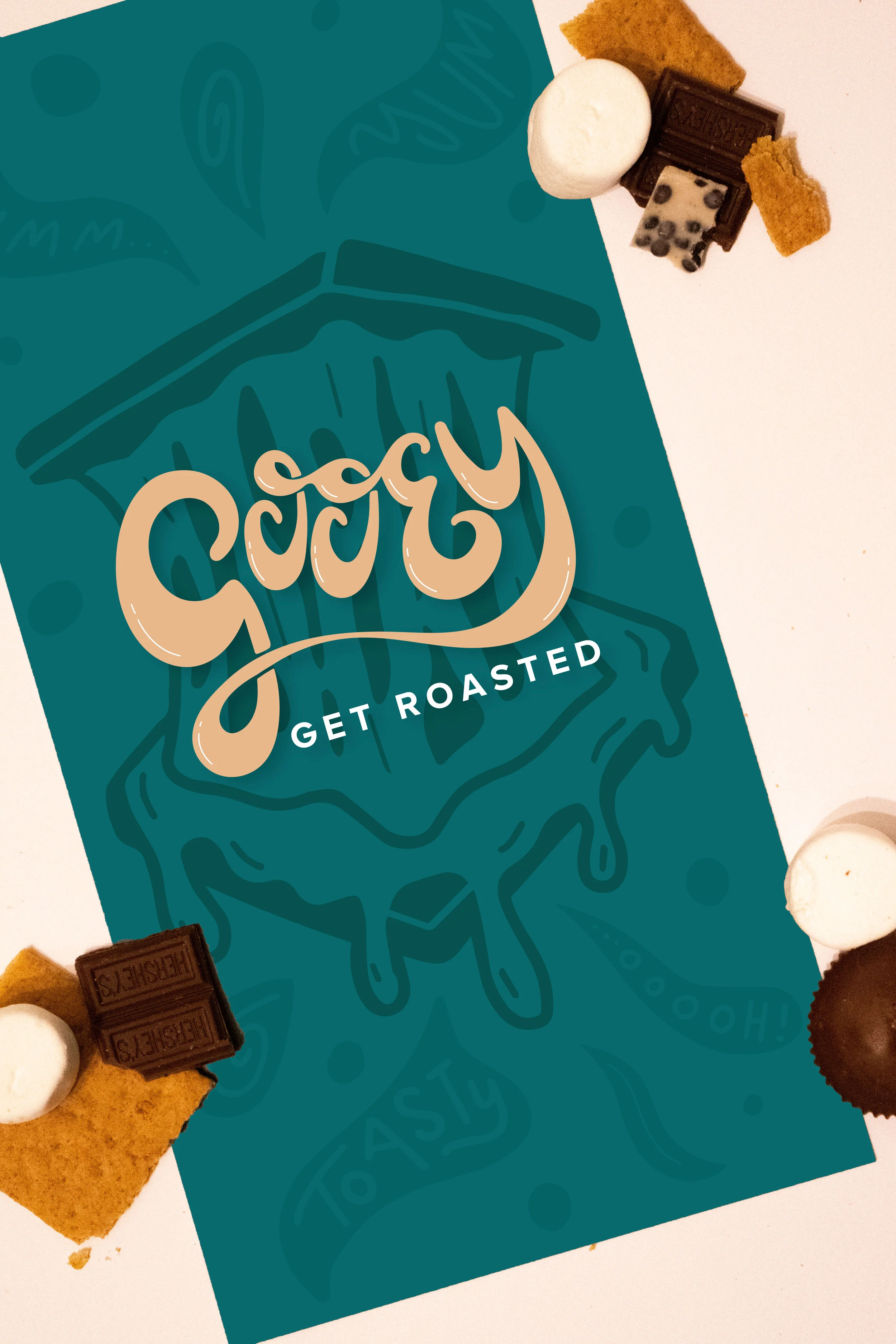
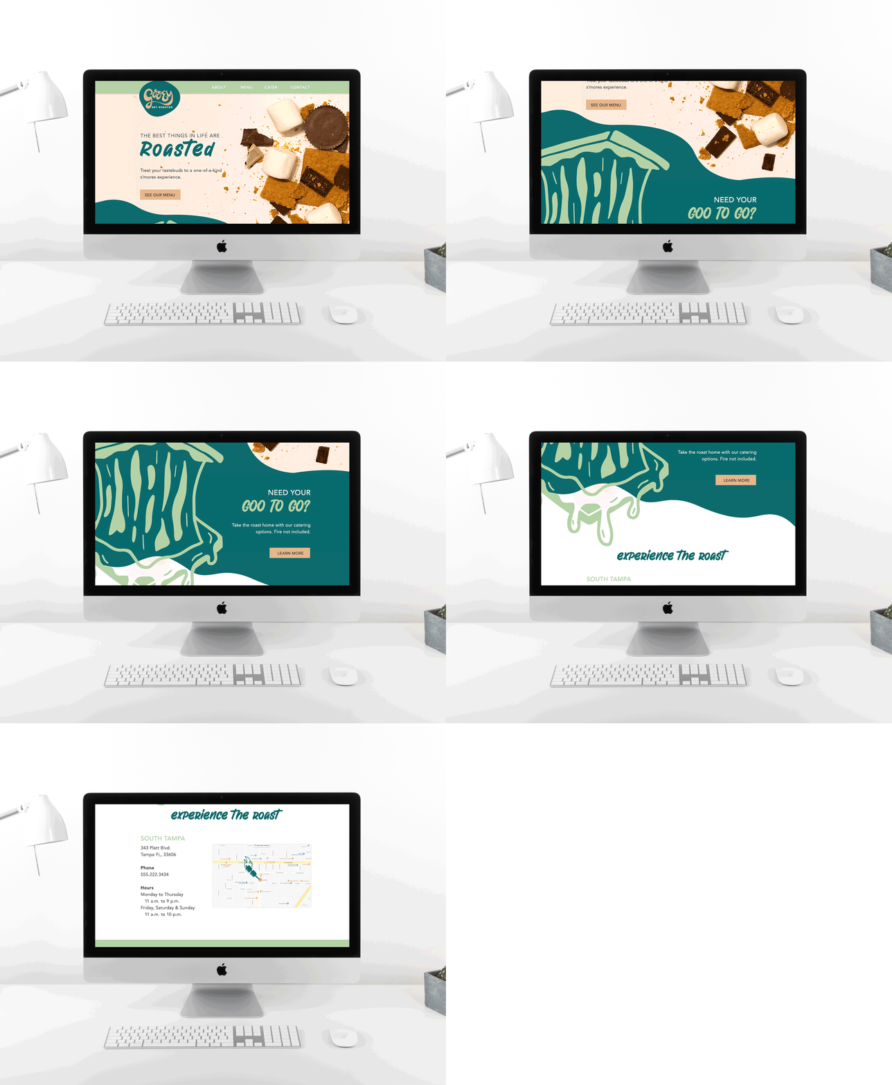
I’d like to introduce you to Gooey, my vision for a funky s’mores restaurant. I created an entire brand identity for my mythical and fantastical restaurant, inspired by Andy Warhol’s use of color and Chipotle’s use of illustration.
The color palette is modern, fresh and approachable. I wanted people to feel instantly curious as they looked at the logo, as the name and design itself evokes such a familiar feeling surrounding that oh-so-fun word: gooey. The design reflects the word, and the copy reflects the design. A playful jester, the brand works to make guests feel like they’re hanging out with an old pal. The s’mores are just a bonus.


